This component gallery was once started for a workshop and used to build this website, I later corrected everything and rebuild it with all the new tools and technics I’ve gained through my mentors and lots and lots of research.
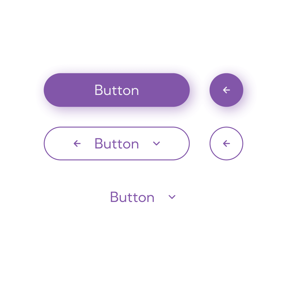
A button component is a fundamental user interface element in software development and design. It is typically used to trigger an action when clicked or tapped by the user. Buttons are an essential part of user interfaces in applications, websites, and other interactive systems, and they come in various styles and types.
Styles
States
Anatomy
Layout & Spacing
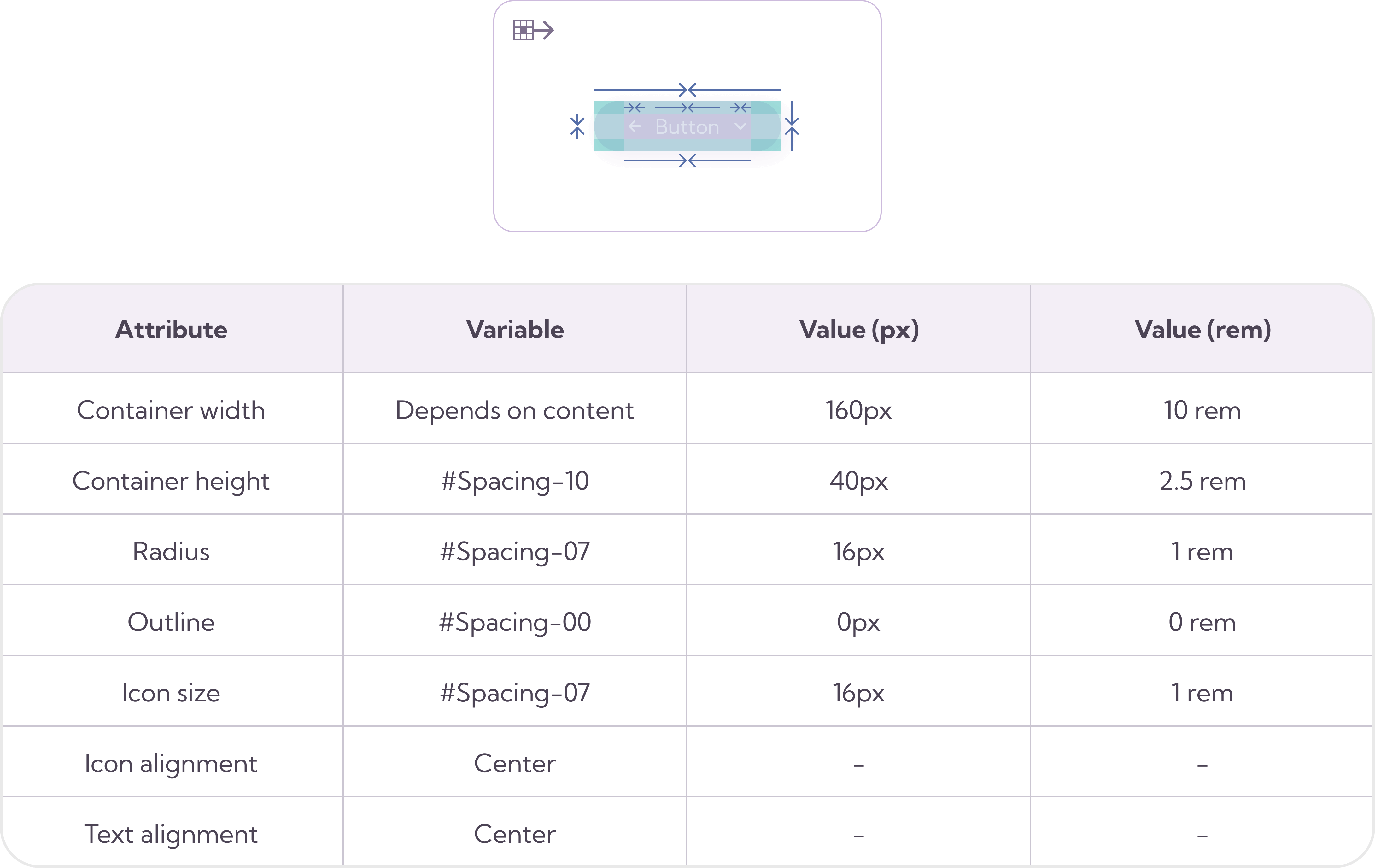
Sizes
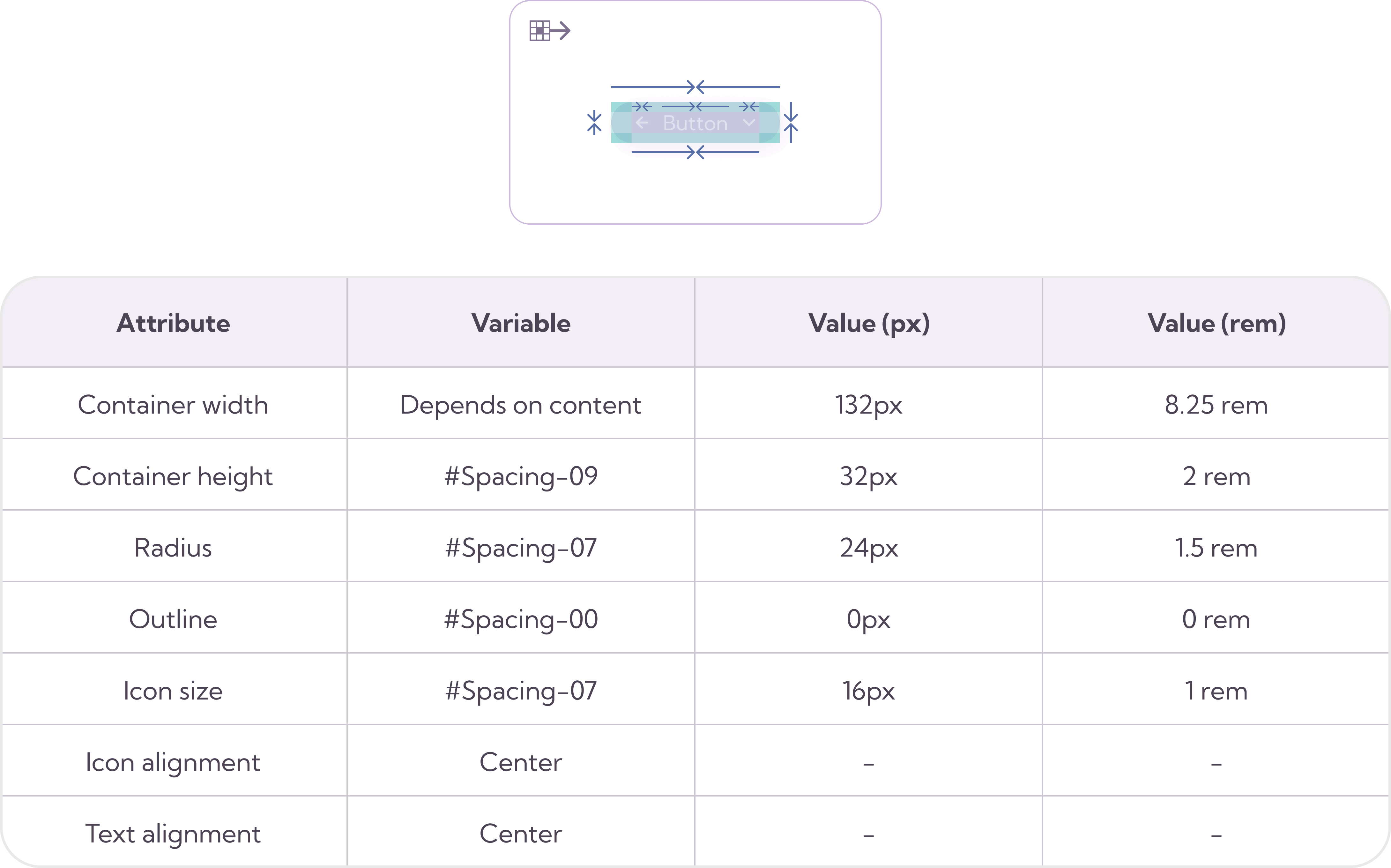
Small
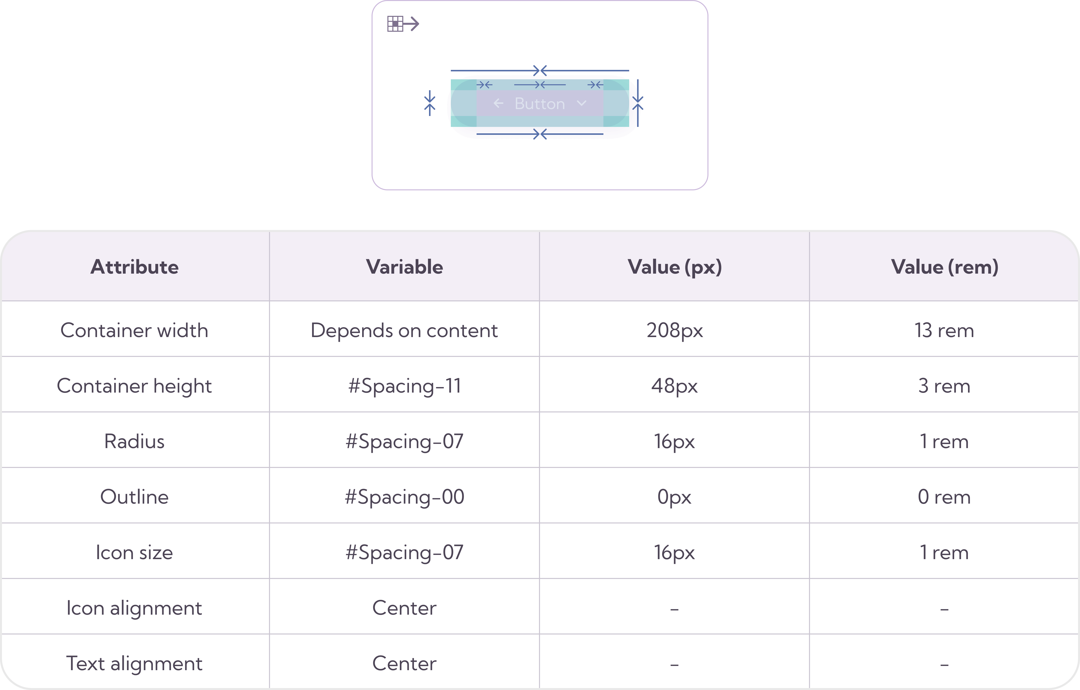
Large
CTA
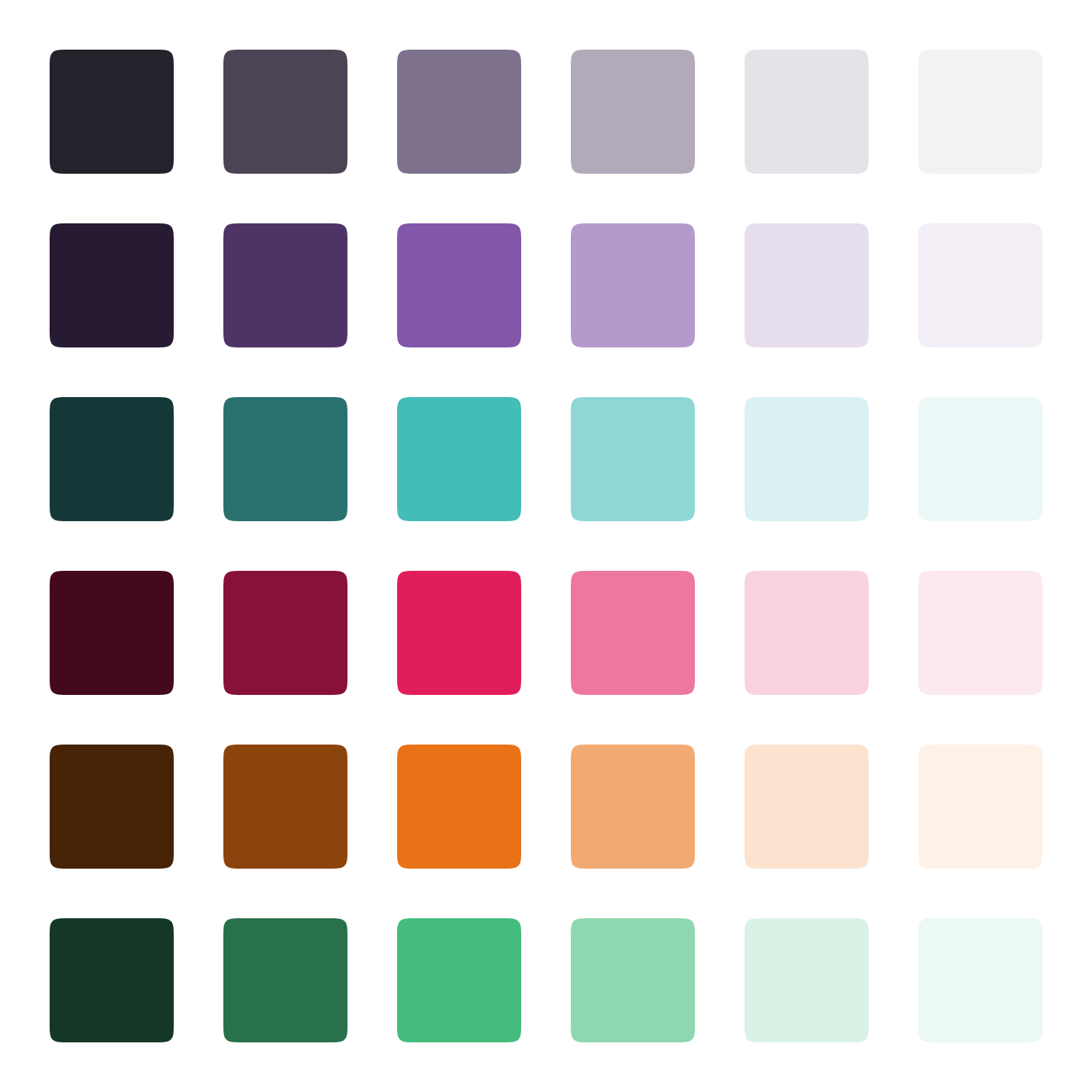
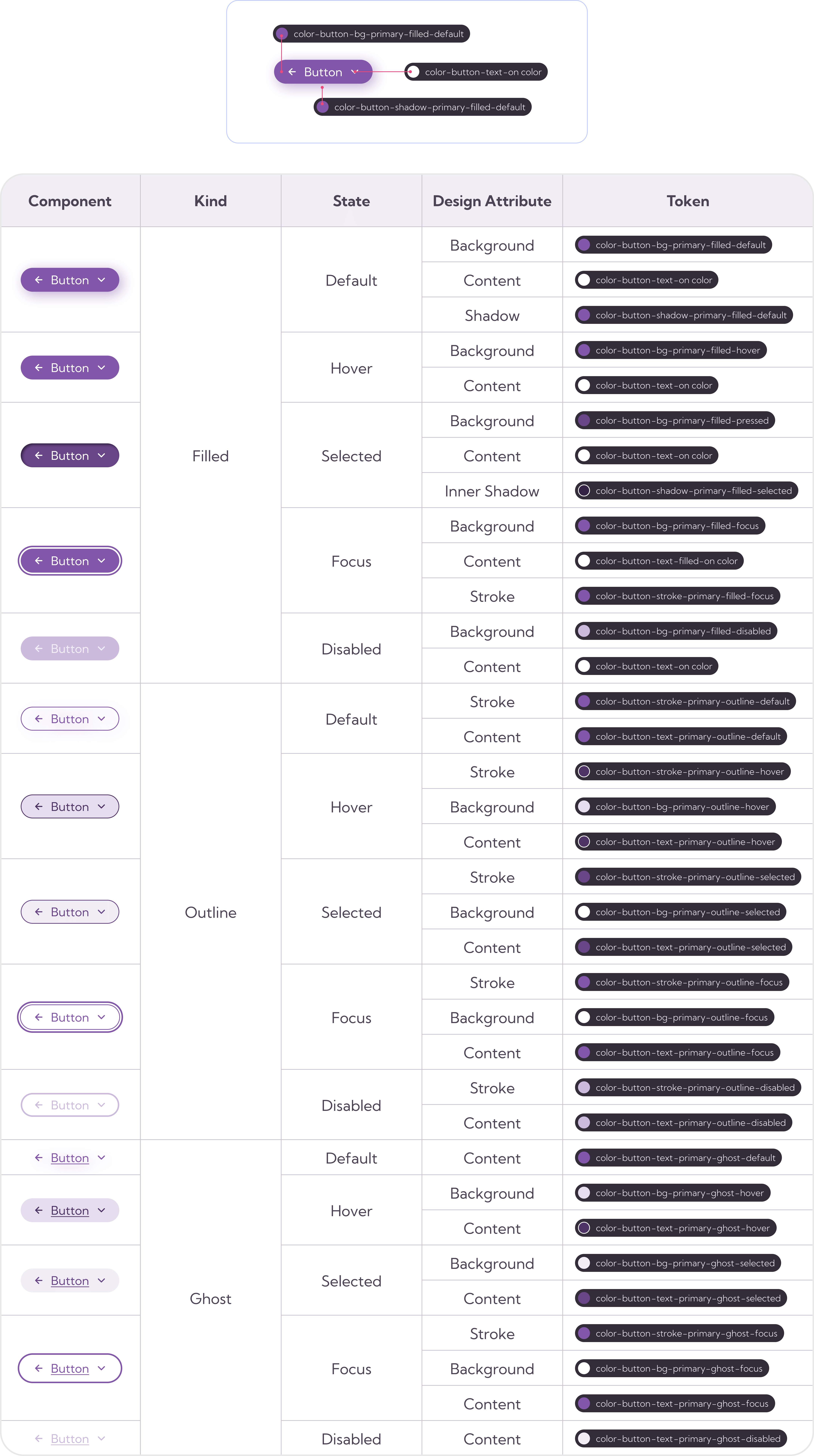
Color tokens
Info
Purpose and Functionality: Buttons are interactive elements designed to initiate actions when clicked or tapped by users. These actions can include submitting a form, navigating to another page, confirming a choice, or performing a specific task.
Types of Buttons:
Primary Button: Often used for the most important or primary action on a page, such as submitting a form.
Secondary Button: Used for less critical actions or as a secondary option.
Icon Button: Buttons that display an icon or symbol instead of or alongside text.
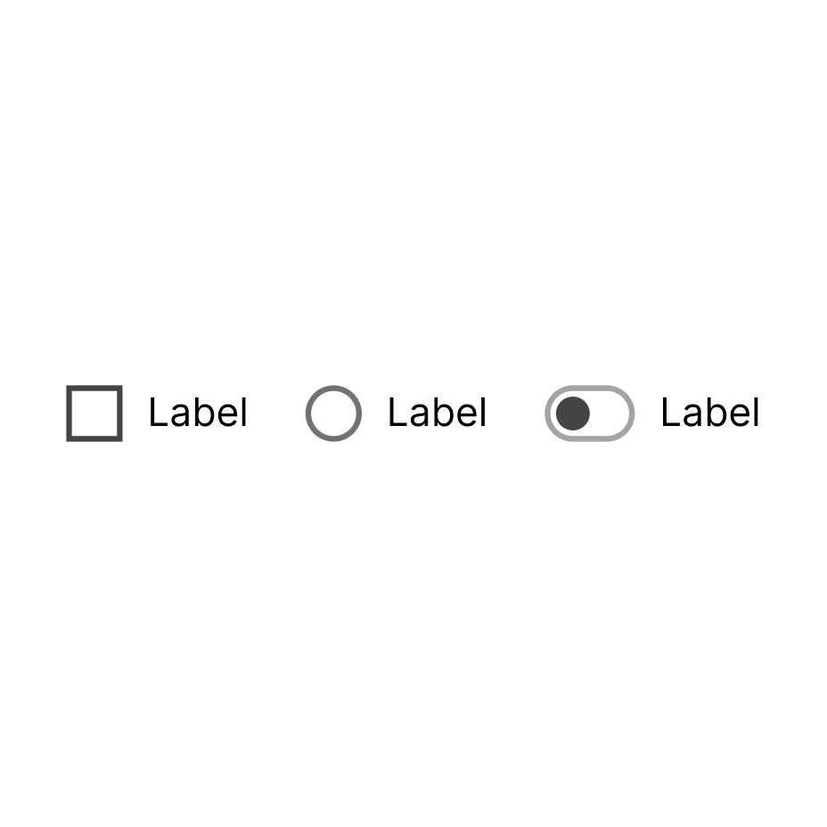
Toggle Button: A button that toggles between two states, such as an on/off switch.
Floating Action Button (FAB): A prominent circular button often used in mobile applications for a primary action.
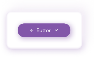
Dropdown Button: A button that opens a dropdown menu with additional options.
Submit Button: A button in a form that submits the form’s data to a server.
Cancel Button: Used to cancel or exit a current action or operation.
Visual Appearance: Buttons have a distinct visual appearance to make them stand out from other elements on the screen. This appearance includes size, shape, color, text, and often visual effects like shadows or gradients. Buttons can have different states, including default, hover (when the mouse pointer is over the button), active (when the button is being clicked or tapped), and disabled (when the button is not clickable).
Accessibility: Buttons should be designed and implemented with accessibility in mind to ensure they are usable by people with disabilities. This includes providing text labels, using proper HTML semantics, and implementing keyboard navigation and screen reader support.
Implementation: Buttons can be implemented using various technologies, including HTML and CSS for web development, and platform-specific widgets or components for mobile app development. Popular libraries and frameworks like React, Angular, and Vue.js provide button components for building web applications.
User Feedback: Buttons often provide visual feedback when clicked or tapped to indicate that an action is in progress. This may include changing the button’s appearance, displaying a loading spinner, or showing a success or error message.
Best Practices: Follow established design and usability best practices when designing buttons, such as maintaining consistency in button styling, positioning buttons logically, and using clear and concise button labels.
Testing and Usability: It’s important to thoroughly test buttons to ensure they function as expected across different browsers and devices. Conduct usability testing to assess how users interact with buttons and gather feedback for improvements.
Responsiveness: Buttons should be designed to work seamlessly on various screen sizes and devices, including desktops, tablets, and mobile phones.
Localization: Consider localization and internationalization requirements when designing buttons. Allow for translations of button text to accommodate different languages and cultures.
Security Considerations: For buttons that trigger critical actions (e.g., making a payment), implement security measures like confirmation dialogs to prevent accidental clicks.
When to use
Form Submission
Confirmation Dialogs
Call to Action (CTA)
Navigation
Filtering and Sorting
Toggle and Switches
Actions in Toolbars or Menus
Modal Dialogs
Error Messages
Interactive Elements
Messaging and Alerts
Download and Upload
Games and Interactive
Media
How to use
Identify the Purpose: Determine the specific purpose of the button. What action or function should it trigger when clicked or tapped? Clarify its role in the user interface.
Button Labels: Use clear and concise labels for buttons. The label should convey the action or purpose of the button. Avoid vague labels like “Click Here” or “Submit Form.”
Placement and Layout: Position the button logically within the user interface. Place primary action buttons prominently and secondary actions or cancel buttons as secondary options. Use consistent button placement throughout your application or website to establish familiarity and ease of use.
Grouping Buttons: Group related buttons together, such as “Save” and “Cancel” in a form, or “Next” and “Previous” in a multi-step process. Use button groups or button bars to visually organize and group buttons.
Interactive Behavior: Provide appropriate feedback to users, such as loading indicators or success/error messages, when the button initiates a process.
Testing and Usability: Thoroughly test buttons in various browsers and on different devices to ensure they function as expected. Conduct usability testing to gather user feedback on button placement, labels, and overall effectiveness. Localization and
Internationalization: If your application is used in multiple languages and regions, allow for translations of button labels to accommodate different languages and cultures.
Security Considerations: For buttons that trigger critical actions (e.g., delete or payment), implement additional confirmation dialogs or security measures to prevent accidental actions.
Example
Code accessibility
Ensuring accessibility for buttons in your user interface is crucial to making your application or website usable by a wide range of people, including those with disabilities
Focus
Guidelines 2.1
2.4.3 Order of focus: Hierarchical architecture of the information that allows sequential navigation of the web page, the checkbox allows it to be “focused” to preserve the interactions and operation of the component, maintaining the coherence of the navegation.
2.4.7 Visible focus: any keyboard must be able to focus the component with the navigation defined, making the checkbox visible to the user.
Accessibility
Analytics
Levels of compliance
WCAG has three levels of compliance: A (lowest), AA (mid-level), and AAA (highest). The contrast requirements for text and interactive elements differ slightly for each level. Here are the contrast ratio requirements for each level:
Level A (Minimum):
The minimum contrast ratio for text and interactive elements is 4.5:1 for normal text and 3:1 for large text. Large text is defined as text that is 18pt (24px) or 14pt (18.66px) bold or larger.
Level AA (Intermediate):
To achieve AA compliance, the contrast ratio for normal text remains at 4.5:1, while the contrast ratio for large text remains at 3:1.
In addition to text, there are contrast requirements for text within images, user interface components, and graphical objects used as parts of user interface components. These also have a minimum contrast ratio of 3:1 against their background.
Level AAA (Enhanced):
Level AAA compliance is the highest level of accessibility, and it has the most stringent contrast requirements.
For normal text, the contrast ratio must be 7:1. For large text, it remains at 4.5:1.
Like Level AA, there are contrast requirements for text within images, user interface components, and graphical objects used as parts of user interface components. These also have a minimum contrast ratio of 4.5:1 against their background.
Contrast check
This, like any other component gallery, is still a work in progress.

